So, you’ve been selling educational resources huh? I bet you’ve been crafting these amazing lesson plans and resources, pouring your heart, soul, and endless cups of coffee into them. But let’s face it, we’re in an age where even the most brilliant content can get lost in the shuffle if it doesn’t *look* the part. Sounds familiar?
Grab your favorite mug, and let’s chat about jazzing up those resources of yours.
7 Quick & Easy Design Tips for Teachers Selling Educational Resources Online
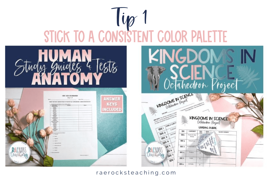
The Power of Colors 🎨
Remember that time you walked into a classroom with bright, cheerful walls and instantly felt energized? Colors do that!
Tip 1 |Stick to a consistent color palette. Maybe choose one primary color that resonates with your teaching style and two complementary ones. But hey, avoid neon green text on a yellow background, okay? 😉
Fonts: The Unsung Heroes 📝
Ever tried reading something in a super curly, fancy font and gave up halfway? We’ve all been there.
Tip 2 | Choose clear, readable fonts. It’s okay to have one ‘fancy’ font for headings, but for the love of all things educational, keep the main content simple and legible!
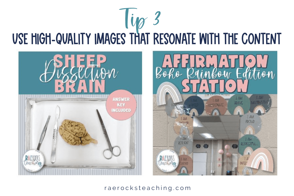
Images: A Picture’s Worth… 🖼️
…a thousand words, right? But not if it’s pixelated or unrelated.
Tip 3 | Use high-quality images that resonate with the content. And if you’re using them from the internet, ensure they’re copyright-free. We teachers have enough on our plates without copyright issues!
Consistency is Key 🔑
Imagine a resource where every page feels like it’s from a different planet. Confusing, right?
Tip 4 | Keep a consistent design throughout. Whether it’s the color scheme, font, or layout, let there be a rhythm to your resource.
Interactive Elements: Let’s Play! 🎲
Who said resources have to be static and boring?
Tip 5 | Add interactive elements like clickable buttons or drag-and-drop features, especially if it’s a digital resource. It’s like sneaking veggies into a smoothie – learning while having fun!
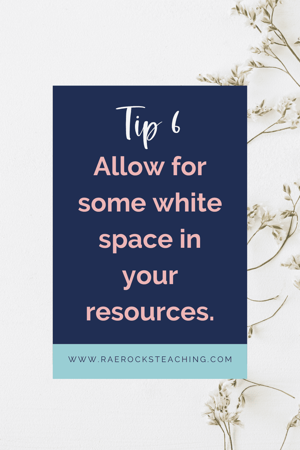
White Space: The Breather 🌬️
Ever felt overwhelmed looking at a cluttered page? Yep, information overload is real.
Tip 6 | Allow for some white space in your resources. It gives the eyes a break and makes the content more digestible.
Feedback Loop: The Goldmine 🔄
Remember that colleague who pointed out that tiny error in your resource, and you were like, “Phew! That was close!”?
Tip 7 | Before finalizing, share your resource with a fellow educator. Fresh eyes can spot design inconsistencies or areas of improvement.
Designing might seem daunting, especially if you feel like you’re more of a ‘words’ person. But trust me, with these tips and a sprinkle of creativity, your resources will not only be effective but also *gorgeous*! And hey, if all else fails, there’s always that artsy colleague or a tech-savvy student you can bribe with cookies for design help. 🍪
Happy designing, and here’s to resources that are as beautiful as they are brilliant! 🌈📚
Don’t forget to grab your FREEBIE 👇🏼
I love sharing helpful content with y’all and would love to connect on IG or Facebook. I’m on TikTok too! Follow me and send me a DM with what you need more of because I’m here to help! If you are looking for even more inspiration, find me on Pinterest!
Wanna read more?
How to Start an Online Teaching Business: A Guide for Aspiring Teacher Sellers


One Response